Editing a Photo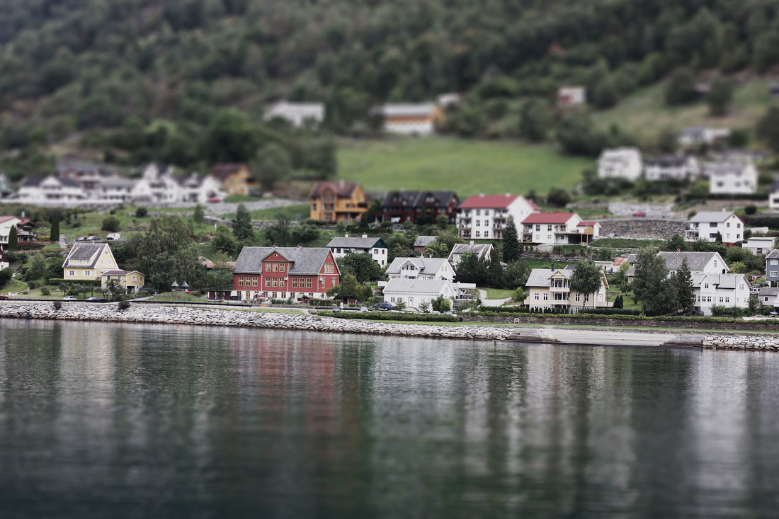
Adding Text to a Photo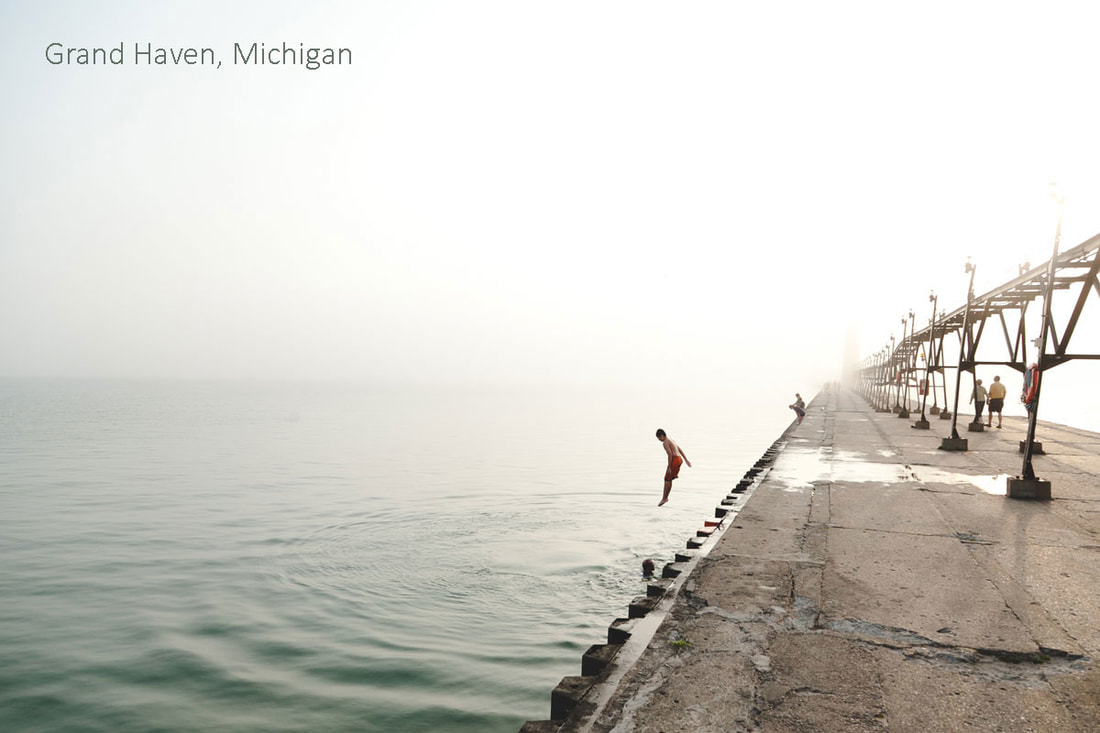
Selection Masking
Removing Objects From PhotosSocial Media Thumbnail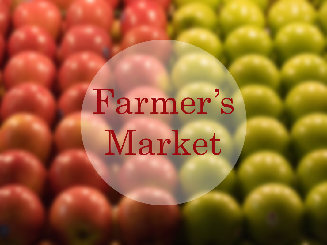
WebsiteBanner
Using a Template Mask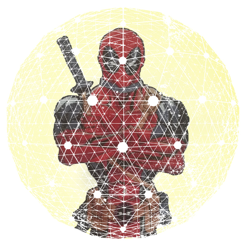
Editing Photos With a Layer Mask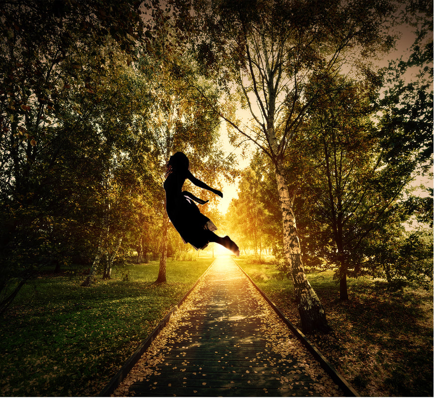
Creating a Poster With TextCreating an event flyer
Applying Corrections
Creating an Animated GIF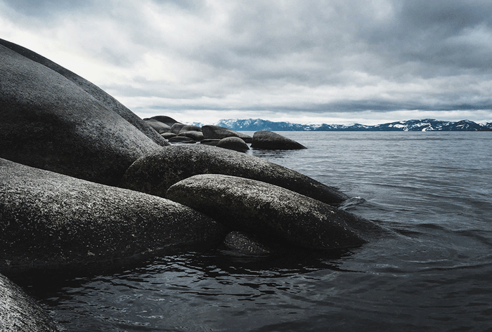
Selection Masking (Composite Images)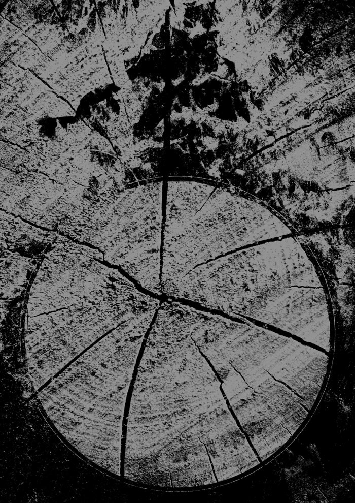
Combine Photos and Images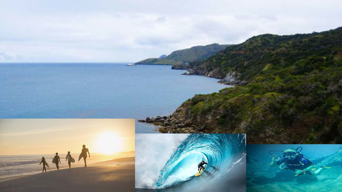
Blend and Color Effects (Composite Images)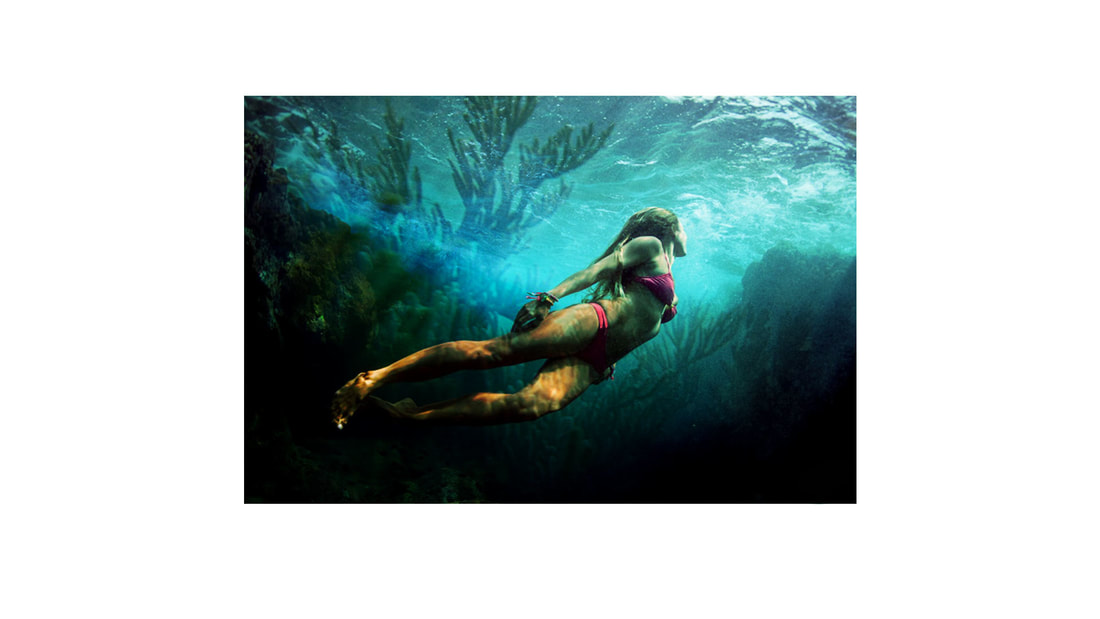
Crop and Straighten an ImageAdjusting PerspectiveFixing a PhotoCreating a Panorama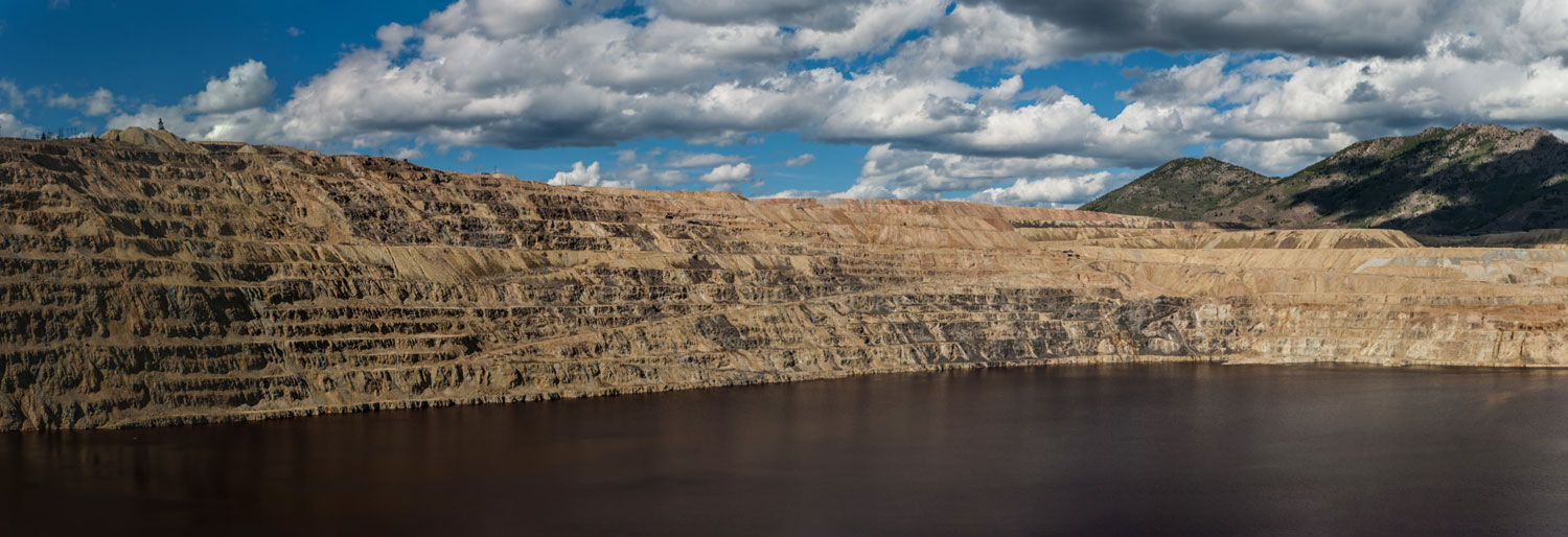
Retouching Images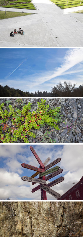
|
My first edit on Photoshop, done on a picture of a small village in Norway. This assignment was enjoyable because it gave me some freedom with the effects, allowing me to create my own image. If I were to do this differently, I would make the blur not as noticeable, so it doesn't seem as bland. If you want to try this project, just have fun with it and explore your options. The simplicity of this assignment was what I liked most while doing it. If I were to change anything, I'd mess around more with the font. For a beginner doing this, just explore and find what kind of fonts and colors fit. I didn't enjoy this assignment too much, there wasn't much to do and the most challenging part was getting a clean selection. If I were to change something, I'd search for a complete tutorial so I could make a more complicated edit. Again, not much to enjoy in this, although the end result is pleasing. I don't know what I would do differently, as the finished product is close to perfect. For a beginner reading this, just watch the instructional video carefully. A very simple assignment, there's not much to enjoy in this project. If I were to do this again, I'd make the text cut through the circle so the apples could be seen through it. For a beginner, there's not an advice to give but to make it your own. Again, didn't enjoy doing this one much, other than the outcome. There's nothing that I'd differently other than possibly change the opacity of the inner shadow. For a new user, just experiment with the opacity levels. Probably my favorite Photoshop assignment yet. I enjoyed experimenting with all the templates and finding what works best for me. I decide to use my own traditional artwork of Deadpool as the background image. A lot went into editing the original image to get it just right. For a beginner trying out this assignment, just have fun with it and find what you like. The end result is all I really like about this piece. It looks nice, but that's pretty much it. The selection was pretty simple and placement is always easy. For a beginner that wants to do this, use slightly more complex images to make it more fun. Again, a very simple project with not much to enjoy. I'd recommend putting some money into TypeKit so you have more fonts to work with. I enjoyed doing this because of the artistic appeal the end result gives. The colors all work in harmony with each other. The most difficult part was getting the right shades or orange for the "salmon". Even the most simple change can make a huge difference in an image. I made the colors slightly darker and brought the reds out a little more, making the fruit seem more vibrant. Another immediate favorite for me, as an aspiring animator. It's fun to take a large group of images like this and create an animation, long long or short. I've done it before with stop motion and also flip book animations, but this is my first using a digital art software. Expect more to come from me, because this certainly won't be the last. This one was just stressful. I was using an Adobe Stock mask collection instead of standard images, along with my computer being extremely slow and not doing what I commanded. But after three days of trying over and over again, I was finally able to get it. For a beginner, I wouldn't suggest using Adobe mask templates, which is what I did. A very simple project. All I really had to do was place embedded images on top of the first picture. Although the image of the family on the bottom left was originally a stock photo so I gave it a slight edit. A fun edit. I spent a good amount of time searching for the right photos and even did did a few extra edits with the brush tool to make it a little more appealing. For a beginner, try messing around with different images and different effects. Again, something I did a few extra edits with, this time with the Spot Healing Brush tool along with the standard brush and Eyedropper. I couldn't find any decent (or appropriate) offset images using a search engine such as Google or Bing, so I instead had to use the image from the instructional, which required to use the snipping tool to get a screen capture, I then used the Spot Healing brush to remove the crop marks, used the Eyedropper and brush to clean things up. After that, I did my own edits with the Crop tool. Once again, something I added some additional edits with the brush to make it look better. After I completely jacked up the perspective, I painted over the clouds and sky to clean everything up. This one was simple yet tedious. I first removed the zip liner with the Lasso tool and a Content-Aware fill, then I repainted some of the clouds to make sure they still looked nice. Unfortunately, while using the content Content-Aware fill, some of the zip line itself was lost, so I used the Patch tool to fix that pixel by pixel. Afterwards, I used the Spot Healing brush to take out some stains and other slightly distracting elements. For a beginner, I would suggest using a different image to keep things a little more simple. Sometimes your camera lens just can't capture a scene in it's full beauty. Luckily, Adobe Bridge is compatible with Photoshop and allows you to take several photos and combine them into one banner-like image. Often people use this as a way to capture landscapes, although it's also the same technique used to make 360 degree images that have appeared on Social Media lately. A little rushed, but I still added a couple extra edits (like always) to each image. In the first one, after removing the second group of people, I drew some lines to make it look like the stones were still there. In the second, after moving the streak to the side, I painted over the sky a bit yo make it look a little more realistic. With the third, I stretched several branches instead of just one. In the fourth, I repainted some of the clouds after removing the wire. And in the final, I used the Spot Healing brush to clean some stuff up after removing the unwanted object. |
